Programming is like Parenting
It started with a post on Practical Developer about finding your new favorite song with Spotify. “I should try that”, I thought.
The comments mentioned Last.FM, a service which tracks your music for you. Eric mentioned a playlist of 45 tracks that are his favorites, but I don’t have that. I have a number of playlists on Spotify, including some designed to get me going on Monday Mornings and some intended to help keep me in flow state, but I didn’t have a list of songs I go back to again and again.
But, with some poking, I soon had it. In CSV form, because I didn’t immediately write my own. And, after a few queries, I decided re-parsing the CSV each time was too slow, and threw it into MySQL.
My thought, then, was to go all DataVis on it and run it through R. I mostly know R as a plotting library, handling data I pre-munge with DBs and other languages, and I have long wanted to “get good” on actually using it as a language.
I can get to top artists fairly easily, and break it down by year with a little bit more work.
artist	        y2008	y2009	y2010	y2011	y2012	y2013	y2014	y2015	y2016	y2017
Happy_Mondays	0	    1	    0	    154	    581	    270	    135	    96	    111	    82
Mogwai	        0	    55	    8	    124	    49	    61	    380	    292	    173	    63
Orbital	        10	    143	    41	    269	    391	    28	    28	    148	    24	    84
Wilco	        1	    137	    71	    63	    37	    16	    225	    152	    58	    193
Daft_Punk	    2	    38	    39	    204	    137	    294	    73	    65	    30	    0
I would hope that, in essence, "Orbital" , 10, 143, 41, ... would be enough to draw a line plot, but nope.
With struggle and help remembered from the last time I tried to struggle with R, I got to
   years Happy_Mondays Mogwai Orbital  Wilco Daft_Punk
   <chr>         <dbl>  <dbl>   <dbl>  <dbl>     <dbl>
 1 y2008          0      0       10.0   1.00      2.00
 2 y2009          1.00  55.0    143   137        38.0
 3 y2010          0      8.00    41.0  71.0      39.0
 4 y2011        154    124      269    63.0     204
 5 y2012        581     49.0    391    37.0     137
 6 y2013        270     61.0     28.0  16.0     294
 7 y2014        135    380       28.0 225        73.0
 8 y2015         96.0  292      148   152        65.0
 9 y2016        111    173       24.0  58.0      30.0
10 y2017         82.0   63.0     84.0 193         0
Which is nice enough. MySQL won’t let you have columns that are numeric, so I was thinking that eventually I would be able to use mapply or sapply to pull the initial y from the years column, but that should be sufficient to allow me to see my top artists.
But, each time I got to the point of ggplot(), it didn’t like it. I looped through each half-remembered plot I wrote in the past, trying to remember how I got it to work, and searching through StackOverflow and trying to get a sense of what R wanted of me.
Until I saw an example that used a data frame they threw together right before plotting. I tried it, looking at the generated frame before plotting, and I figured out the problem. This is what it desired:
year,plays,artist
2008,0,"Happy Mondays"
2008,0,Mogwai
2008,10,Orbital
2008,1,Wilco
2008,2,"Daft Punk"
2008,2,"The Jayhawks"
2008,45,R.E.M.
2008,7,"Explosions in the Sky"
2008,0,Rush
2008,0,"Ozric Tentacles"
2009,1,"Happy Mondays"
2009,55,Mogwai
...
It would group the artists without me. I just needed to get to this point, which, I confess, I broke down and implemented it with Perl, because I could, in the fullness of time, find the right query to get my all-time top-ten artists and their results by year in year,plays,artist format, but it was easier to take my existing query, munge the year, and spit out CSV.
And, from there, it was downright easy to actually plot the thing.
    #!/usr/bin/Rscript

    suppressPackageStartupMessages( require( "Cairo"     , quietly=TRUE ) )
    suppressPackageStartupMessages( require( "ggplot2"   , quietly=TRUE ) )
    suppressPackageStartupMessages( require( "readr"     , quietly=TRUE ) )

    data <- read_csv( 'top_artists.csv' )

    CairoPNG(
        filename    = "/home/jacoby/top_artists.png" ,
        height      = 600  ,
        width       = 800  ,
        pointsize   = 12
        )

    ggplot(data=data, aes(x=year, y=plays, colour=artist)) +
    geom_line() +
    ggtitle( "Top Artists, Plotted by Plays / Year" ) +
    theme( plot.title = element_text( size=24) )
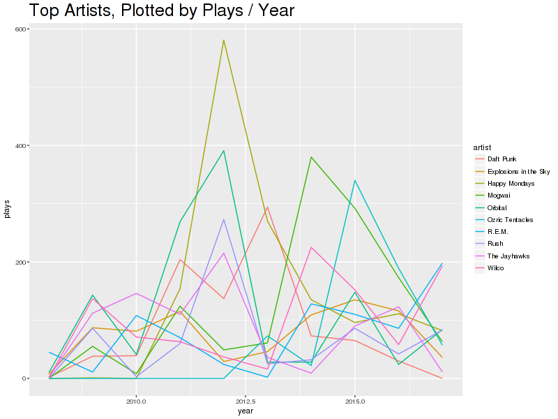
I am pretty sure that I left something repeating Explosions in the Sky overnight in 2012, which is why there’s that spike. Also, I should give Daft Punk some love this year.
While digging through this, it struck me that Programming is like Parenting an Infant. The keys are learning what input it wants, What he output should look like, and what do if either don’t look the way they should.
I suppose the next step is to start with the tracks and plays themselves, building them up a step at a time until I get to that CSV-like level. In fact, I should, if only as a learning experience.
And I think a count of the number of artists per year to whom I listened to one track or less would be interesting.
If you have any questions or comments, I would be glad to hear it. Ask me on Twitter or make an issue on my blog repo.